
Showing posts with label Research. Show all posts
Showing posts with label Research. Show all posts
Wednesday, 27 April 2011
Target audience rated
Horror film poster research
In the world of media there are many different stereotypes that allow a certain film to relate to its genre when it comes to its presentation as a poster. It is incredibly important that when it comes to my research I take into account that my target audience will be of the age of 15 and over. Before I reach the design stage of actually beginning to create my film poster I wanted to gain a thorough and detailed understanding of the contents that go into actually making a poster, as well as use comparisons that will allow me to distinguish the most popular and successful film posters in order to benefit my own final design. When it comes to actually studying these posters and breaking them down individually I wanted to collect a range of different techniques that go into creating a successful film poster. In my research I have focused on looking into the Misenscene and text input within each of the posters, as well as the types of images used and the way the genre of the film is portrayed to the intended target audience.
Paranormal Activity poster research
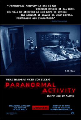
The film poster for Paranormal Activity uses a similar technique with the use of black and white shades, yet the overall effect is portrayed and viewed in a much different way by the audience. The genre of the film is obviously the same as that of ‘The Shining’ as it sticks to the stereotypical components that make up a horror film; such as the Misenscene, lighting and use of camera angles. The image used within the poster is situated towards the top of the page which adds a realistic angle to the way in which the viewer will look at the image. It is as if it has been placed on a tripod to heighten the expanse of what is being seen in the image. A medium shot is used to get as much of the miscenscene into the image as possible, so as to allow the viewer to gather as much information as possible about the films narrative. The use of editing and effects is established with the use of dark shades, this has really been used effectively where there appears to be the silhouette of a person on the door leading into the room. This is a major clue towards the future narrative of the film as the viewer isn’t actually shown what will be included as a Supernatural element, yet they know it has something to do with the ‘unknown’ as the dark shadow is mysterious and uninviting. The layout of the poster is similar with the image being situated in the middle of the page; the image itself is quite detailed in terms of the established genre that the film is focuses on. The use of darker shades has really allowed the typical conventions of a horror to come through, for example the colour red used within the font usually relates to blood and danger. The lighting conventions used within the posters are quite stereotypical as the overall effect comes off as black and white; this really allows the poster to fit with the genre of a Horror film as darkness mixed with the use of light allows the sub-genre elements of a Supernatural film to be portrayed. The tag line included within the poster is situated at the bottom of the page within the main title of the film. The words used within the tagline are simple yet they have an effect on the viewer in terms of what they take out of its meaning. The warning that is given at the end of the tagline is what really gets the viewers adrenaline pumped up. The one major technique used within the tagline is when the viewer is told not to see it on their own, already they become curious towards what they may come to expect in the film. At the top of the poster there are a number of reviews and quotes that are used to advertise and entice the viewer to want to watch the film. The way in which the quotes have been worded also plays a big part with the advertising of the poster itself; as well as any posters being portrayed. The words used allow a sense of fear to be established within the viewer such as ‘Nightmares are guaranteed’ and ‘You will be affected as it’s hard to ignore’. When it comes to actually creating my film poster for my horror trailer I may choose to use quotes from my target audience after I get them to watch the trailer so as I can make the narrative become as personal as possible to the viewer. It may however me a good idea for me to just leave out the quotes from reviewers as that way they wont know what to expect. This would benefit my poster as I will have more space to include editing as well as the fact that I can use simplistic elements within the misenscene to establish a positive outcome when my audience come to view the poster.
Tuesday, 26 April 2011
Scream poster research

This is an example of a film poster rated 15 for the movie Scream. The Misenscene is incredibly simplistic with the use of dark shades and minimalist text; this allows an immediate mood to be established which in turn portrays the overall genre of a Horror. The use of such a simplistic setting creates a successful and positive impact on the audience’s reactions as they are only given a selected amount of information when it comes to the films narrative. This then attracts them to want to watch the film even though they don’t know much about it. The use of a black and white image is quite typical within the Horror genre and it has been used in many other well known films such as ‘The Exorcist’, the absence of colour creates the sense of the ‘unknown’ where the audience have nothing to relate the film to in terms of colour, for example red may relate to blood which is typical within horror posters. There is only one slight use of colour and that is within the woman’s eyes this technique may be used to highlight her innocence and the fact that her facial features express fear allows the audience to wonder what it is that she is afraid of, which in turn makes them pity her. When creating my movie poster I may consider just using plain shades and colours when portraying the Supernatural element within my genre of a Horror film. The use of lighting is sectioned within the overall page of the poster to portray an eerie atmosphere, the sides and background of the image is in black whereas the actual picture of the woman is bright, this establishes a shadow like effect that creates a mysterious outlook. The tag line of the film is included within the poster situated at the top of the page which is a method to entice the viewer to watch the film. The words used are made to intrigue the reader such as the phrase ‘One step to far’ which is a popular phrase in the movie industry as well as other obvious words such as ‘Mystery and Murder’. The title of the film has been placed at the bottom of the poster; which I have noticed within my research is typical within many other horror posters making the genre quite stereotypical. When it comes to me actually creating my film poster I am going to use this technique to portray my films title as I feel it will benefit the narrative of what it is I am trying to establish.
Total film magazine research

The masthead of the magazine ‘Total Film’ is bright and very much contrasting to the usual design layout of a film magazine. The colours used are luminous and attractive which catches the audience’s attention immediately. The font size is large in the fact that it stands out from the page. The cover image goes over the front of the masthead which is a popular technique used in many magazines if they are well known enough for their readers to recognise their masthead.
The Cover line of the magazine ‘Total film’ is centred in the middle of the page, to draw the reader’s attention. Usually the cover line is situated n the left side third of the page yet it also works well with the technique used within this edition of ‘Total film magazine’. The size of the font used within the cover line is large and bold which allows it to stand out from the page. The colours used within the misenscene of the cover line are bright and eye catching using range of different shades and tones to portray the sci-fi genre of the tones to portray the sci-fi genre of the copy.
The puff of the magazine is presented within the magazine front cover to advertise the rest of its contents to the reader. The way in which it is presented suits the rest of the layout of the magazine, the colours used are subtle in terms of how bold and noticeable they are. The silver text boxes along with the bold text allow the puff to be noticed by the reader. The colour range used within the puff is quite plain in terms making it stand out. It may have benefited the magazine if the puff stood out in terms of the colours used, for example red or gold which resemble power and dominance. ‘Total Film’ advertises a number of puffs to get the reader interested in the contents of the magazine. The use of bold text and similar colours again used in the text fit the conventions of the design layout this again attracts the reader, yet it may have benefitted the magazine if they focused on advertising the cover image a bit more.
The barcode included within the magazine signifies that the magazine is legal which means that it is a product made to be sold to the public. If a magazine doesn’t include a bar code it either means that it cannot be sold publicly or it is an illegal copy made for readers to buy, usually for more money.
It is important that any magazine presents the date of the issue being sold as well as the issue number which in some cases is optional. This allows the magazine to advertise itself in other ways such as online. ‘Total film’ has included a website address where the reader can go on and research the magazine and its issues. Magazines that advertise using different forms of media are very much more successful then those that don’t.
Empire magazine research

When it comes to the magazines layout, it is essential that the issue date and price are included within its misenscene. Without the use of the time and date the magazine may not be eligible to be sold or it may be a fake. The price of the magazine lets the reader know what they are paying to view within the magazine.
The cover image presented within ‘Empire’ magazine is simplistic in terms of its layout and use of colour. The image is bright with just the main picture centred in the middle of the page, surrounded by a black background. The image itself relates to any given target audience which suits ‘Empires’ range of readers. The lighting used is quite dark yet the image itself is animated which plays a part in the way it is displayed in terms of the purpose of the image.
The plug of the magazine portrays the contents that relate to the main cover line. The layout of the plug is very much simplistic with the basic use of font style and colour. The use of exclamation marks really adds a sense of importance and interest to the plug as it catches the readers’ attention. The use of bullet points when listing what is involved within the cover line creates quite a professional image in terms of the design layout. The gold stars are quite symbolic in terms of what they represent in the film industry; this allows the magazine itself to portray its content in a positive and successful way to its readers.
The puff of the magazine allows the reader to get an idea of what is included within the magazines contents. The layout of the puff is discrete as the main focus of the magazine is its cover line which is the theme of the issue; relating to the film being released. The blue used within the text box allows the puff to stand out so that the reader knows what else is included within the contents. The font used is bold and relatively large to stand out from the rest of the page.
The mast head of the magazine allows the reader to memorise and recognise the name of the magazine. It is important that the mast head is bold and colourful; the overall size of the font is large which allows it to stand out from the page. The actual size of the font takes up the whole of the skyline at the top of the page the size of the font allows the magazine to attract its readers, as well as the fact that it creates a dominant portrayal. The colour red really emphasises the masthead which draws the reader’s attention immediately. The colour itself comes across as quite hard and powerful which is what makes the masthead so successful when attracting its audience.
Horror Trailer Research
The portrayal of Horror when it comes to film teaser trailers varies in terms of the narrative of the film as well as the age group. 18 rated films contain an extensive amount of gore and effects that are either made to psychologically disturb its target audience or physically manipulate them into wanting to watch the film. The difference with a 15 rated film is that the actual purpose of the trailer is to entice its target audience to feel unsettled when watching the trailer as well as encouraging them to view the film. Within my coursework I have decided to focus my genre of a Horror Teaser Trailer on 15 rated films as I feel the age group is best suited when trying to get a positive form of feedback when watching the trailer. The rating of the film depends entirely on the narrative as well as the misenscene included within it content. There are a range of different sub- genres that appear within the genre Horror and these may come in the form of Supernatural, Science fiction as well as Thriller each all different forms of Horror to be depicted. In my teaser trailer I have decided to focus my work on the sub-genre of Supernatural, I feel that it allows me to When it comes to me actually researching into areas within my production I have to focus on the fact that the ratings of some trailers effect the way in which a film may be portrayed entirely.When researching the techniques used within film trailers for the genre of Horror I have looked at all the specific and most important aspects that make up the trailer and allow it to be successful.
The Shining trailer
The Shining Trailer
This trailer is very different to that of Psycho as as it contains no form of dialogue just Non diegetic music in the background. The use of Misenscene used within the trailer is simple yet the colours used suggest to the theme of violence, for example the red lift doors which may be symbollic to that of blood which is a BIG hint to the future narrative of the trailer and film.Throughout most of the beginning part of the trailer nothing of significant importance actually happens yet the Non digetic music used allows an errie atmospher to be created which in turn keeps its audience captivated in their seats wondering what is going to happen. The lighting used through out the trailer is quite musty and dull which helps to create a level of insecurity within the viewer as they being put into an uncomfortable situation where by anything can happen. This technique I feel is quite successful as it stereotypically follows the conventions of the Horror genre. Take a look for yourself and let me know what you think.
This trailer is very different to that of Psycho as as it contains no form of dialogue just Non diegetic music in the background. The use of Misenscene used within the trailer is simple yet the colours used suggest to the theme of violence, for example the red lift doors which may be symbollic to that of blood which is a BIG hint to the future narrative of the trailer and film.Throughout most of the beginning part of the trailer nothing of significant importance actually happens yet the Non digetic music used allows an errie atmospher to be created which in turn keeps its audience captivated in their seats wondering what is going to happen. The lighting used through out the trailer is quite musty and dull which helps to create a level of insecurity within the viewer as they being put into an uncomfortable situation where by anything can happen. This technique I feel is quite successful as it stereotypically follows the conventions of the Horror genre. Take a look for yourself and let me know what you think.
Psycho Trailer
_shower_scene.jpg)
Psycho Trailer
I really enjoyed watching this and I think the way its been done has made the audience become more involved with the misenscene featured within the film itself. The way in which the trailer has actually been structure is i think quite successful, the director of the film is the one who is introducing its 'spooky' misenscene to the audience, which in a way makes them feel more involved with the narrative that is going on in the film. You will notice that throught the trailer the narrator is constantly giving out clues towards the future narrative where he begins to tell the audience something then all of a sudden moves on to another subject. This I found was very amusing and made me intrested in what it was that he was going to say. The ending is also effective including the films most famous scene.... but i wont tell you the rest just watch it for yourself
I really enjoyed watching this and I think the way its been done has made the audience become more involved with the misenscene featured within the film itself. The way in which the trailer has actually been structure is i think quite successful, the director of the film is the one who is introducing its 'spooky' misenscene to the audience, which in a way makes them feel more involved with the narrative that is going on in the film. You will notice that throught the trailer the narrator is constantly giving out clues towards the future narrative where he begins to tell the audience something then all of a sudden moves on to another subject. This I found was very amusing and made me intrested in what it was that he was going to say. The ending is also effective including the films most famous scene.... but i wont tell you the rest just watch it for yourself
Subscribe to:
Posts (Atom)